My Mood Board Process: How I Build One That Actually Helps
A mood board should guide decisions, not just look pretty. Here is how I build one: what I collect, what I leave out, and how I use it from first sketch to final file.
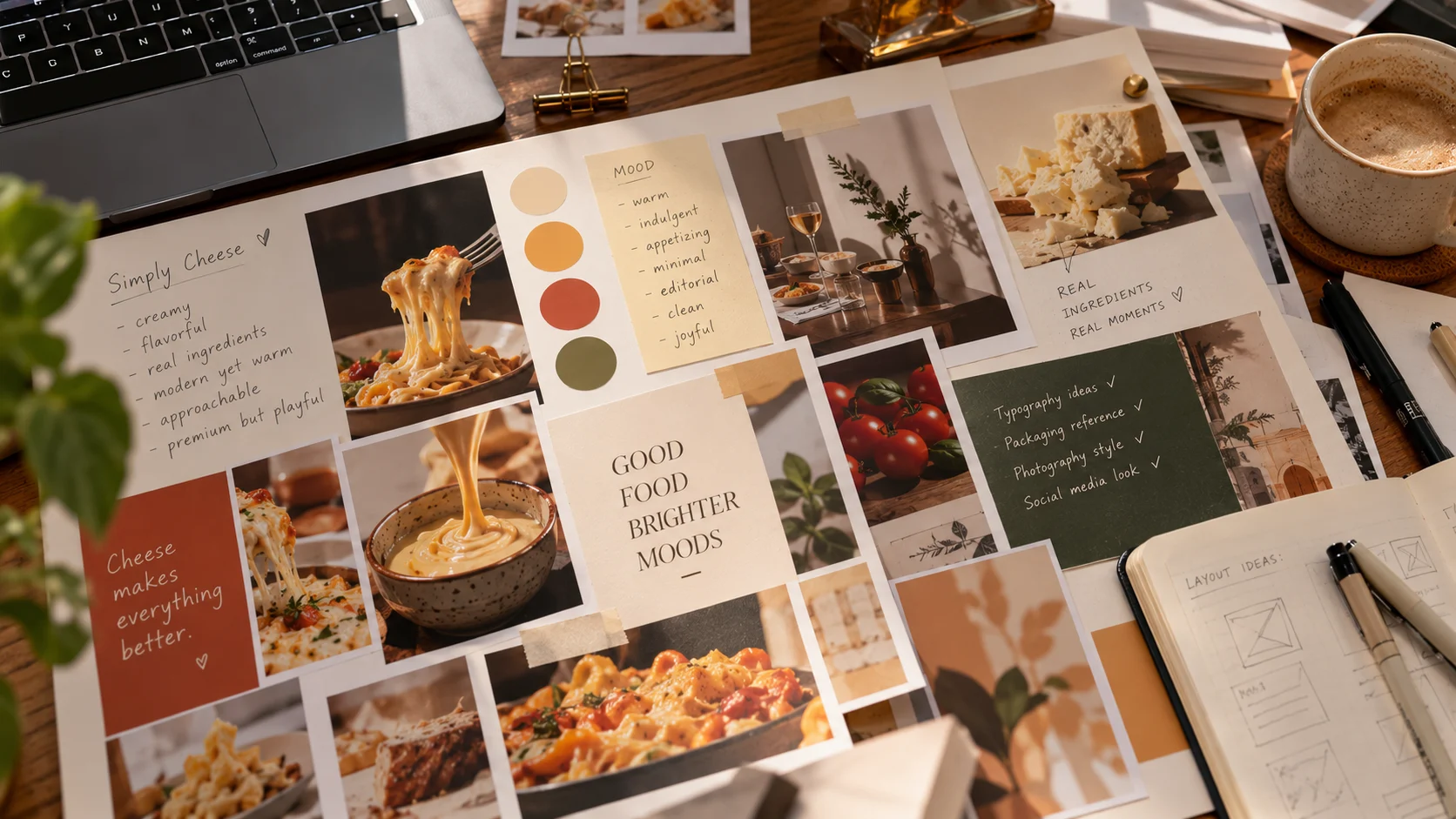
Most mood boards I see look wonderful and do nothing. They are a collage of images that feel right, pinned together and then forgotten. A good mood board is different. It is a working tool that helps me make decisions and explain them.
What a mood board is actually for
A mood board answers one question: how should this project feel? It is not a layout, a logo direction, or a finished idea. It is a shared reference for tone, colour, texture, and attitude.
I use mine in three ways:
- To keep my own decisions consistent across a project
- To agree on direction with a client before I design anything
- To check my work later and ask whether it still matches the original feeling
If a board does not help with at least one of these, it is just decoration.
Step 1: Start with words, not images
Before I collect a single picture, I write down three to five words that describe the feeling I want. For a dairy brand it might be warm, honest, crafted, fresh. For a tech event it might be sharp, energetic, modern.
These words become my filter. Every image I add has to match at least one of them. Without this step, a board turns into a pile of things I simply like.
Step 2: Gather widely, and look outside the category
Now I collect. I save far more than I need, and I deliberately look beyond the obvious.
If I am designing for food, I do not only look at food brands. I look at:
- Old posters and printed ephemera
- Architecture and interiors
- Book covers and editorial layouts
- Textiles, ceramics, and packaging from unrelated products
- Photography with a mood or light I want to borrow
I am not collecting designs to copy. I am collecting qualities: a colour relationship, a way of using white space, a texture, a typographic attitude.
Step 3: Edit hard
This is the step most people skip, and it matters most. I cut the collection down to between 9 and 15 images.
For each one I ask:
- Which of my keywords does this support?
- What exactly am I borrowing: colour, texture, mood, or composition?
- Does it repeat something already on the board?
If I cannot answer the second question, the image goes. A board with 40 images gives mixed signals. A board with 12 makes a clear point.
Step 4: Organise it so it says something
I do not scatter images randomly. I group them so the board reads in a deliberate order:
- Colour: a small palette pulled from the strongest images
- Type: one or two examples of lettering or typography with the right attitude
- Texture and material: paper, fabric, light, surface
- Mood: the images that carry the feeling more than any detail
I also add a short note beside each group in plain words, such as "warm and slightly faded, not bright" or "tight spacing, confident but not loud". These notes keep the board from being read in the wrong way.
Step 5: Show it to the client before designing
I share the board early and ask one question: does this feel right? I do not ask whether they like the images. That difference matters.
Clients often cannot describe what they want, but they react quickly to what they see. A board lets them say "more like this, less like that" before any design time is spent. It catches a wrong direction after an hour, not after a week.
Agreeing on feeling first means we are arguing about ideas later, not about taste.
Step 6: Use it throughout the project
The board stays open next to my work. When I choose a colour, I check it against the palette. When I am stuck between two type options, I look at the board and ask which one belongs there.
At the end of the project I hold the finished design next to the board. If the feeling matches, the board did its job. If not, I look for where the design drifted.
Mistakes I try to avoid
- Too many images. More input leads to more imitation and less thinking.
- Only looking at competitors. The result is a safer version of what already exists.
- Choosing images I like instead of images that fit. The board belongs to the project, not to me.
- Treating it as a final design. A mood board sets a direction. It does not replace sketching.
- Making it once and forgetting it. A board that is never used again was wasted effort.
Tools I use
You do not need anything special. I build boards in a simple layout tool or even a printed sheet, depending on the project. What matters is the editing, not the software. A pinned sheet of paper with twelve well-chosen images beats a digital board with a hundred.
A quick way to try it
On your next project:
- Write down four words for the feeling you want
- Collect 30 images, including some from outside your field
- Cut them down to 12 using your words as a filter
- Add one short note to each group
- Keep it next to you while you design
You will probably find that design decisions get faster, and easier to explain, once the feeling is settled first.