How I Choose Typefaces That Fit the Message
A typeface is the voice of a design. Here is how I choose one: starting with tone, testing for legibility, pairing with care, and avoiding the mistakes that make good work look amateur.
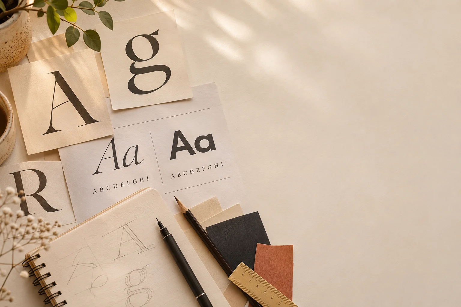
Type is the first thing people read and the last thing they notice. When it works, nobody comments on it. When it is wrong, the whole design feels off, even if no one can say why. Choosing a typeface is one of the most important decisions in any project, so I treat it slowly.
A typeface is a voice
Imagine the same sentence said by three different people: a calm newsreader, a loud street vendor, a quiet friend. The words are identical, but you hear three different messages. Typefaces work the same way.
A heavy, tightly spaced sans-serif sounds confident and direct. A light serif sounds calm and refined. A rounded face feels friendly and approachable. Before I look at a single font, I decide how the message should sound.
Step 1: Describe the tone in plain words
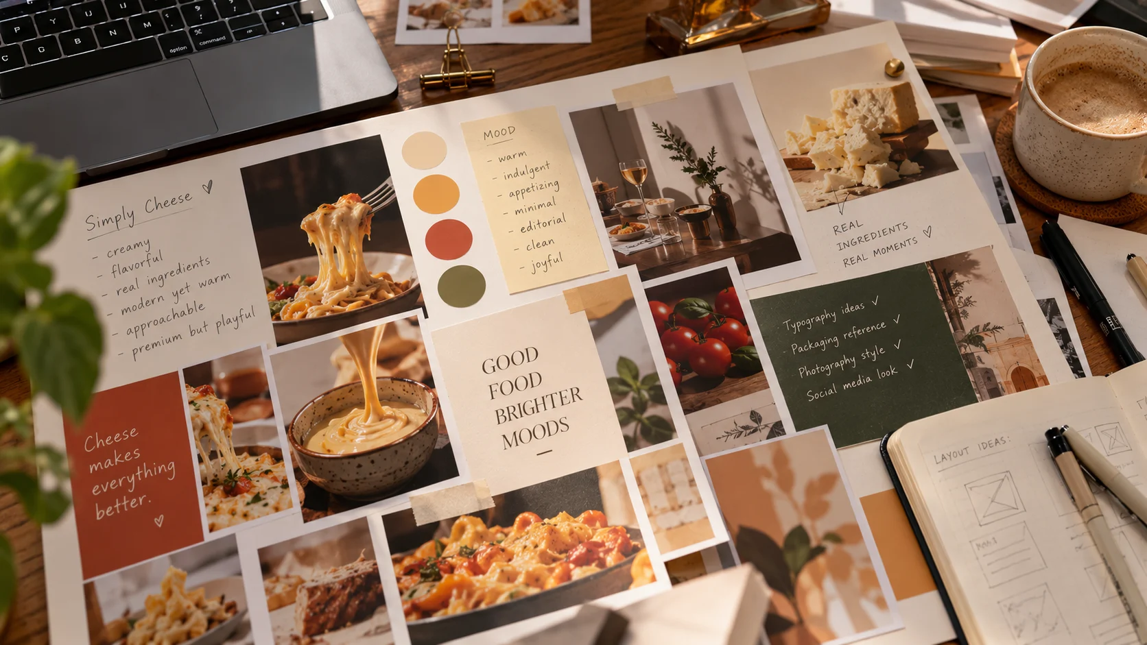
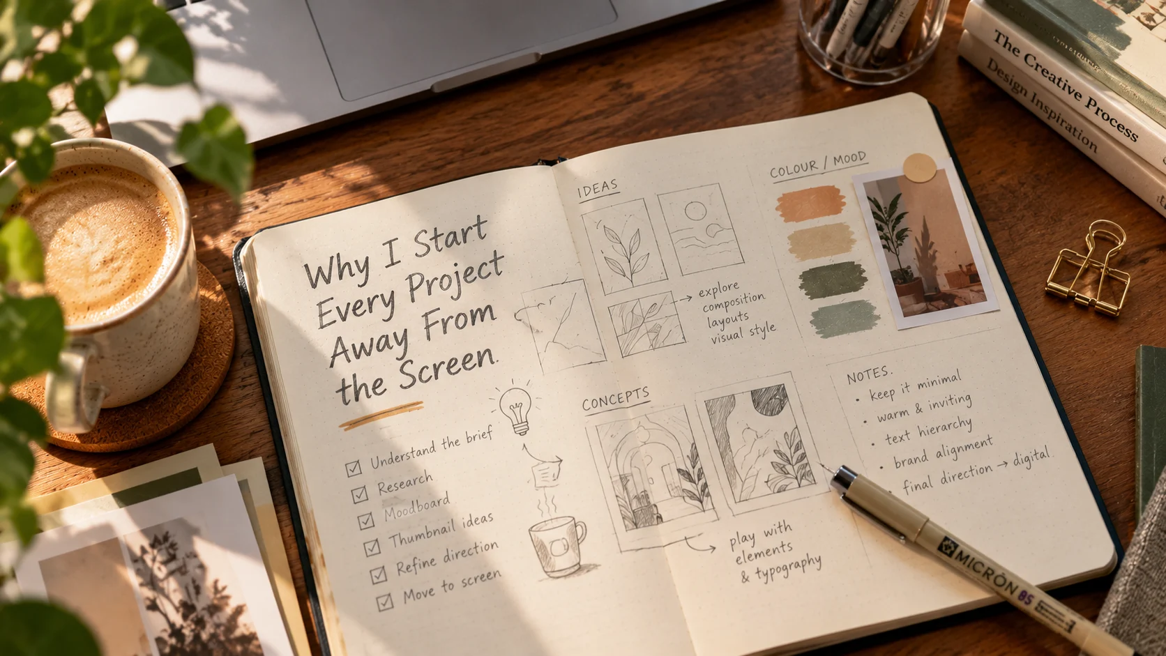
I write down three words for the voice I want, such as warm, honest, crafted or sharp, modern, fast. This is the same habit I use for mood boards, and it works for the same reason: it gives me a filter.
Then I ask what the audience is doing when they read it. A label on a shelf is seen from an arm's length in two seconds. A poster is read from across a room. A report is read slowly for an hour. The same typeface cannot serve all three.
Step 2: Start with the job, not the font
Different parts of a design do different jobs, and I choose type for each job separately.
- Headlines need personality and can carry more character
- Body text needs to be calm and comfortable over many lines
- Small text like labels and captions needs clarity above all
- Numbers and data need clear, evenly spaced figures
A beautiful display typeface can be a poor choice for body text. A neutral workhorse can be a dull choice for a headline. Most good designs use each where it fits.
Step 3: Test legibility properly
A typeface that looks great in a specimen can fall apart in real use. I always test it at the size and in the setting it will actually be seen.
I check:
- Size: does it stay readable at the smallest size I need?
- Similar letters: can I tell apart I, l and 1, or O and 0?
- Weight range: are there enough weights to build a clear hierarchy?
- Language support: does it handle every character and language the project needs?
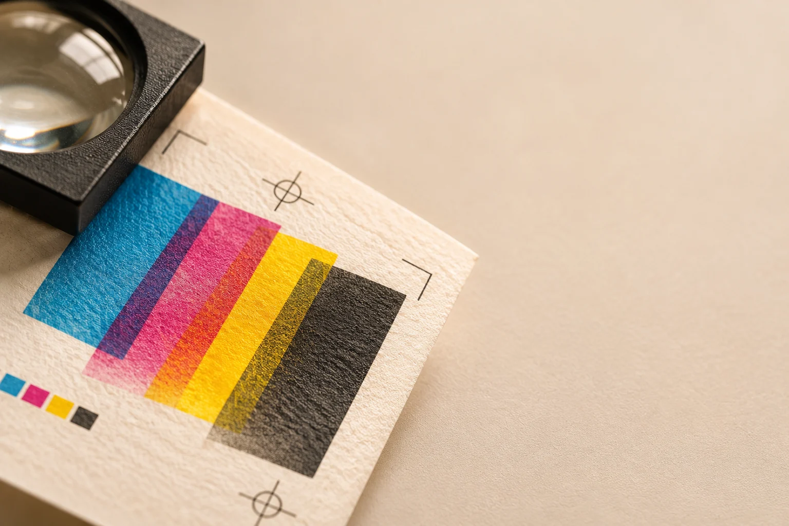
- Surface: how does it look on screen, in print, and on the material it will be printed on?
On packaging, I print the text at actual size and hold it at arm's length. Screens flatter type. Paper tells the truth.
Step 4: Pair with care
Pairing is where many designs go wrong. My rules are simple:
- Use two typefaces at most, and three only for a very good reason
- Make the contrast clear, not slight. Two similar fonts look like a mistake
- A serif with a sans-serif is a safe and reliable pairing
- Pick one typeface to lead and let the other support
- Often a single family with several weights is enough
If two typefaces are almost the same, the viewer feels something is off without knowing why.
Step 5: Build hierarchy with what you have
Good type tells the reader where to look first, second, and third. I build this with a few simple tools:
- Size: the biggest thing is read first
- Weight: bold pulls attention, light steps back
- Spacing: space around text makes it stand out
- Case and tracking: capital letters with a little extra spacing work well for small labels
I try to use as few variations as possible. If everything is bold, nothing is.
Step 6: Respect the details
Small details separate careful work from careless work:
- Set comfortable line spacing, usually about 1.4 to 1.6 times the type size for body text
- Keep line lengths between roughly 45 and 75 characters
- Adjust spacing between letters in large headlines
- Avoid stretching or squashing a typeface to make it fit
- Use proper quotation marks and dashes instead of the straight versions
None of these are glamorous. Together they make a design feel finished.
Mistakes I try to avoid
- Decorative fonts for long text. They look striking in a headline and tire the eye in a paragraph.
- Too many typefaces. Each new one makes the design feel less certain.
- Choosing trends over the message. A fashionable font can date a project within a year.
- Poor contrast. Light grey text on a white background looks elegant and reads badly.
- Ignoring licences. Always check that a font may be used commercially before a client sees it.
A quick way to practise
Take one paragraph of text and set it in five different typefaces, all at the same size. Look at each and write down how it sounds. Then ask which voice best fits the message.
You will quickly see that the "best" typeface does not exist. There is only the right typeface for this message, this reader, and this moment.
Legibility first, personality second.