Colour on Screen vs Colour in Print: Why They Never Match
That vibrant colour on your screen rarely looks the same on paper. Here is why it happens, how I plan for it, and the checks I run before a design goes to print.
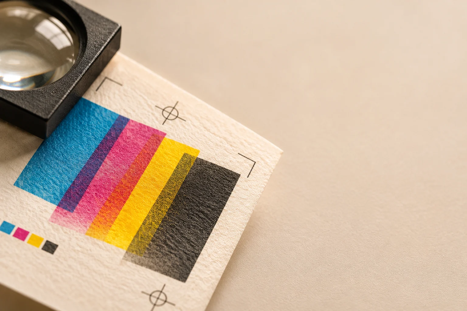
Every designer has had the same moment. A design looks glowing and rich on screen, and the printed sample arrives looking flat, darker, or slightly off. Nothing went wrong. Screens and paper simply make colour in two completely different ways.
Why the difference exists
A screen makes colour by emitting light. It mixes red, green and blue light (RGB), and because the light comes from behind the image, colours can look bright and saturated.
Print makes colour by reflecting light. Inks (usually cyan, magenta, yellow and black, or CMYK) sit on paper and absorb some light while reflecting the rest. The paper itself is never a perfect white, and it cannot glow.
The result is that some colours a screen can show, especially vivid blues, greens, oranges and neon shades, simply cannot be reproduced with standard inks. This range of colours that a process can reproduce is called its gamut, and print's gamut is smaller than a screen's.
Other things that change the result
Even when the file is correct, several factors shift how a colour looks on the final piece:
- Paper stock: uncoated paper absorbs ink and looks softer and duller, while coated paper keeps colours sharper
- Paper colour: a warm cream sheet changes every colour printed on it
- Finish: gloss, matt and soft-touch coatings all alter how colour looks
- Printing method: digital, offset and screen printing each behave differently
- Lighting: the same print looks different under daylight, warm bulbs and shop lighting
- Your own screen: brightness, calibration and night mode all change what you see
What I do before a design goes to print
1. Work in the right colour mode from the start. If a job is going to print, I set the document to CMYK early, so there are no surprises at the end. Converting a bright RGB design to CMYK at the last minute is where most disappointment happens.
2. Check which colours are out of gamut. Most design software can warn me when a colour cannot be printed accurately. I adjust those colours on purpose instead of letting the software choose a substitute.
3. Use spot colours for brand-critical colours. When a brand colour must be exact, such as a logo colour, I ask about using a Pantone (spot) ink. It is more consistent than mixing from CMYK, though it costs more.
4. Ask for a physical proof. A proof printed on the actual paper is the only honest preview. I never approve colour-critical work from a screen alone.
5. Calibrate and use soft proofing. I keep my monitor calibrated, set to a sensible brightness, and use the software's proof preview for the target paper. It is not perfect, but it gets me much closer.
6. Match the proof to the lighting. I look at the proof in daylight, not under a desk lamp, before I decide whether the colour is right.
Designing so the colour holds up
Some choices make colour survive the trip from screen to paper:
- Avoid relying on very bright neons or electric blues, which print poorly
- Use slightly richer, deeper versions of colours, because print often looks lighter than expected
- Avoid tiny differences between similar shades, because they may merge on paper
- Keep large flat areas of one colour simple, because uneven ink coverage shows more there
- Test dark colours, because heavy ink on thin paper can look muddy
Design for the paper you will print on, not the screen you design on.
Talking to clients about colour
Clients often compare a printed piece with the colour they saw on their own phone or laptop. I set expectations early:
- Explain that screens and print are different, and that a small difference is normal
- Share a physical swatch or sample when colour matters
- Agree a colour reference, such as a Pantone number, instead of "the blue from the logo"
- Approve colour on a proof, not on a screen
This one conversation prevents most arguments later.
Common mistakes
- Designing in RGB and converting at the end
- Approving colour from a screen
- Ignoring the paper colour and finish
- Assuming the printer will "fix" it
- Using one file for both web and print without adjusting it
A simple test you can try
Pick one bright colour from a project, such as a vivid blue or green. Make two versions of the same design, one set up for screen and one converted to CMYK. Print the second on two different papers, one coated and one uncoated, and compare all three in daylight.
You will see the differences clearly, and you will plan for them from the first day of the next project.